An eclectic collection
This months staff blog is written by Senior Designer Mateen…
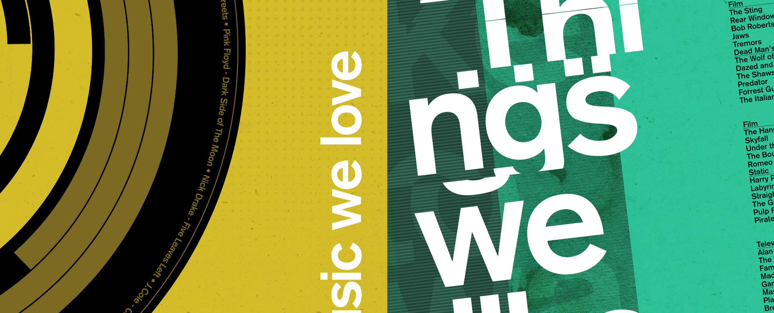
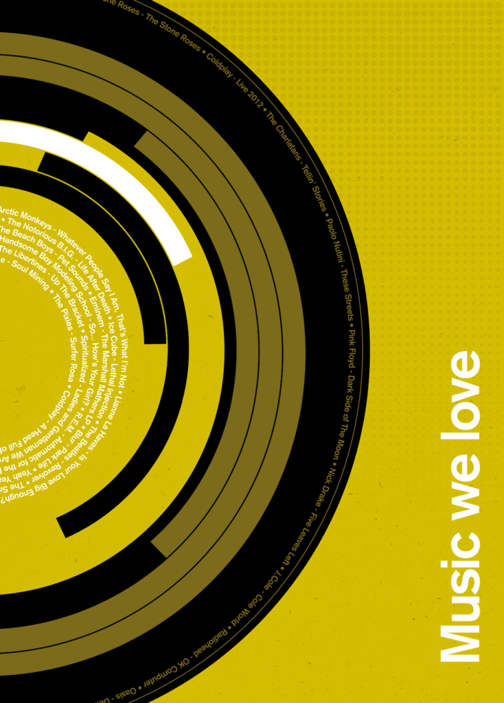
Seeing as we all enjoy some form of arts or entertainment here at Cite I decided to make a couple of posters that showcase just that. It’s an excuse to have a bit of fun whilst combining some of the stuff I love; music, film and design.
And of course, the splendid people I have to work with.
We’re all into such different things and there’s definitely an eclectic mix of tastes here, you just need to hear some of the random tunes that pop up on our Spotify to know what I mean, plus there’s always someone going on about a film that you need to see or the latest TV show you’ve never heard of.
The posters are kind of inspired by the Swiss Style design movement which was developed in the 1940s and 1950s. Also known as the International Typographic Style, the movement had a massive impact on graphic design through the mid 20th century and most of its pioneers expressed their creativity through posters, which at the time was seen as the most effective form of communication.
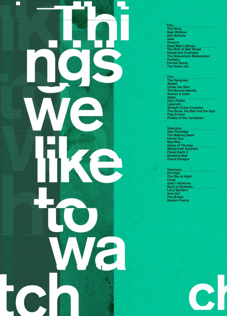
Visually, the style is best known for its use of sans serif typefaces like Univers, Helvetica and Akzidenz-Grotesk, alongside the use of a mathematically constructed grid that helps structure content and define its hierarchy.
Having been made aware of this style back in my university days I think it’s always influenced how I look at trying to solve design problems one way or another. It’s great how it places emphasis on clear design, legibility and simplicity – pretty much my go to principles as a designer and still totally relevant in our industry today, nearly 70 years later.