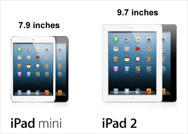
iPad mini shows the need for responsive design
Earlier this month, Apple’s iPad Mini went on sale, and not surprisingly customers around the world waited in line for hours to be the first to buy the new device. The smaller, cheaper counterpart to Apple’s iPad will be in direct competition with products like Amazon’s Kindle Fire and Google’s Nexus 7, and is already establishing itself as a popular item among consumers. Amazingly, within its first three days on sale, it sold 3 million units. As a digital agency we’re always excited about new tech gadgets, but this one is particularly interesting because it heralds in a new screen size that web developers will have to cater to.

The iPad Mini has a 7.9 inch display, a departure from the 9.7 inch display of the iPad 2. The new display size, however, is still a different size from the Google Nexus 7 and the Kindle Fire HD, both of which have a screen size of 7 inches. With all these display sizes available, what are web developers to do?
Our web developers have been advising clients that the best way to future proof a website is to build it using responsive design. With new devices being release all the time, screen sizes are no longer standardised or predictable. Responsive design solves this problem by allowing websites to figure out what screen size a visitor is viewing a website on and reconfigure content to fit the screen. By building a website with responsive design, one version of the site will suit everyone’s Internet viewing preferences and leave less work for site administrators.
We’re not the only ones who have noticed the multitude of screen sizes out there. American comedian Conan O’Brien recently released a spoof advert for iPad Mini that humourously shows his take on how many screen sizes now exist. While his commercial is fictitious, it does help illustrate how quickly and frequently display sizes change and the need for website administrators to be prepared for anything.
At Cite, our web developers have helped leading brands like Premier Foods and Datum improve their websites through responsive design. For more information or to speak to us about a quote, please contact us today on 0116 254 9888.


