Design in 2022
Last month, we rounded up our digital predictions for 2022 from a few members of Cite. This month, we gave the power to Head of Studio, Tom, and his team. Over to you guys!
Trends (passing fads)
Firstly a look at the trends we will see this year but probably not beyond. Those ‘flash in the pan’ styles that are perfect for short-lived social campaigns but probably not great choices to build your brand around…
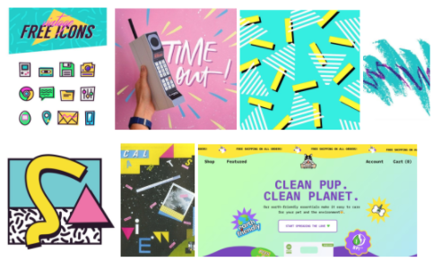
Retro shapes & palettes
Everything comes back around. A few years ago it was Walkmans, Etch-a-sketch, and Stranger Things – the second coming of the 80’s. This year, the 90’s is back. You’ll see it everywhere, whether it be the abstract pastel shapes that used to adorn every American kid’s TV show set, or the intense vibrant block colours of the early web. Driven by nostalgia, the 90’s kids are graduating from ‘up-and-comers’ to market drivers and business leaders.
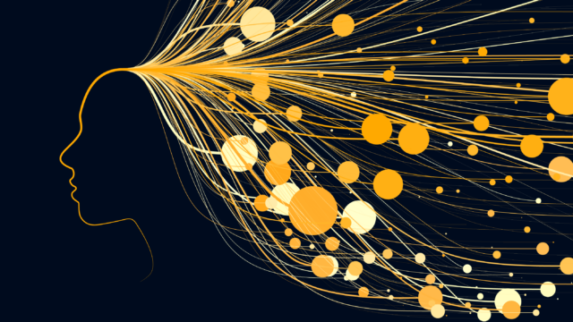
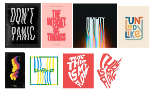
Wild typography
Typography says much more than just the words it renders. The right choice of font can add an unspoken sub-text to any design. Want to say you’re quintessentially British but not actually say it? Use Gill Sans. Want to say you’re classy, but personable? Garamond is your guy. Want to say you’re strong enough for any job? You’ll be wanting Standard Bold Condensed.
But sometimes that stuff isn’t enough and you need to say even more without those extra characters. Enter ‘wild’ type, an evolution of the recent ‘kinetic’ type trend that was very prominent in motion graphics from 2018. Driven by the ever-present need to say more in less space, wild typography bends, shapes and otherwise distorts words to add to their meaning and create graphics which tell a story and create strong compositions without relying on photography or illustrations.
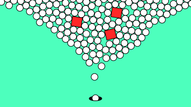
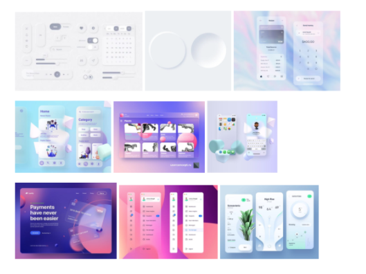
Neumorphism, evolved
First there was skeuomorphism, the practice of making digital things look like their real-world versions. We all remember the early iOS notes app with a faux ring-bound top edge and clunky handwritten font. Then came flat UI and Google’s material design, embracing simplicity and the ‘other’ness of our digital environments. And finally ‘neumorphism’, the beautiful, subtle UI trend that merged the two. Shadows and gradients gave a tactile, almost paper-like quality to these interfaces, while flat and material principles kept them sleek and minimal. It felt like UI design had finally found its place – part Dieter Rams, part Armando González.
But design never stands still. This year, designers the world over will be asking what’s next as neumorphism evolves into glassmorphism, claymorphism and beyond. Sounds like a load of made up words, right? Well it is but that doesn’t mean it’s not happening. From Apple’s MacOS Monterrey and beyond, these evolutions are already becoming a part of your UI environment and you may not have even noticed! We’ll be making the most of the sea change in chip power and pushing GPUs to the limits with smooth, transparent windows. UI designers will be building interfaces that were once the preserve of sci-fi
Trends we can get behind
But what do these trends mean for us? Will you see some of these styles working their way into Cite’s 2022 output? Probably, some. But the real question is where do trends and strong principles overlap? Which styles will look progressive and on-trend in 2022 but become yesterday’s newsprint by December? Which will have legs beyond this year? This is what our studio team are really interested in…
Brutalism and the return of flat UI
At the junction of many recent trends is brutalist UI. Taking its name from the post-war architectural movement where simplistic, blocky structures were prevalent, and materials were shown raw instead of concealed, brutalism can be jarring for some. However, in UI, brutalism builds on the ground seized by flat UI – combining fundamental design principles such as grid systems, minimalism, and behavioural UX. It’s been a trend coming of age for a few years but 2022 will be the year it breaks into the mainstream, embracing necessary design choices, instead of burying them behind fluff and bloat.
But it’s not all rationing and utilitarian design, brutalist UIs make way for technologies to shine and UX to flourish. From variable fonts to accessible colours, when UI is simplified, UX is magnified.
Eco-conscious colour palettes
From high fashion, through interiors, and into design – trends can be predictable. And one trend we’ve seen make this familiar journey is the proliferation of natural colours and textures. Seizing on the zeitgeist, embracing nature and ecological principles isn’t a surprise to anyone. But, with the lurching spectre of green-washing fighting against good CSR across industries, how can we communicate sustainability commitments without over-promising or straight-up capitalising on woe?
Simple. We say without saying. Enter organic palettes. Neutral colours will be everywhere in 2022 and rightly so.
Conscious design, sustainability and brand culture
There has been increased focus on sustainability, requiring brands to engage proactively and not simply ‘greenwash’ – of which customers are keenly aware – making sustainability a key part of brand values. Rising expectations of working flexibility during the pandemic has challenged traditional work cultures and processes. Brands must not only focus on generating a compelling brand experience for customers but also employees, developing and following through on actions and promises.
Thoughts? We’d love to hear what you think! Tweet us @citedms